Overview
Emerald Fund came back to Brooklyn United for a brand and website for their new luxury building in downtown San Francisco, 150 Van Ness. I created a brand that works in tandem with sister building 100 Van Ness while still standing on its own.
ROLE
Lead Designer,
Art Direction of Renderings
local inspiration
150's sister building, 100 Van Ness, has thousands of images in its Instagram geolocation tag. I looked back through years of these posts, putting together an idea of the kinds of people who live in these buildings. We then drew color inspiration from the images of the city shot from 100 Van Ness, focusing on the glowing pink light of San Francisco.
Comprehensive brand system
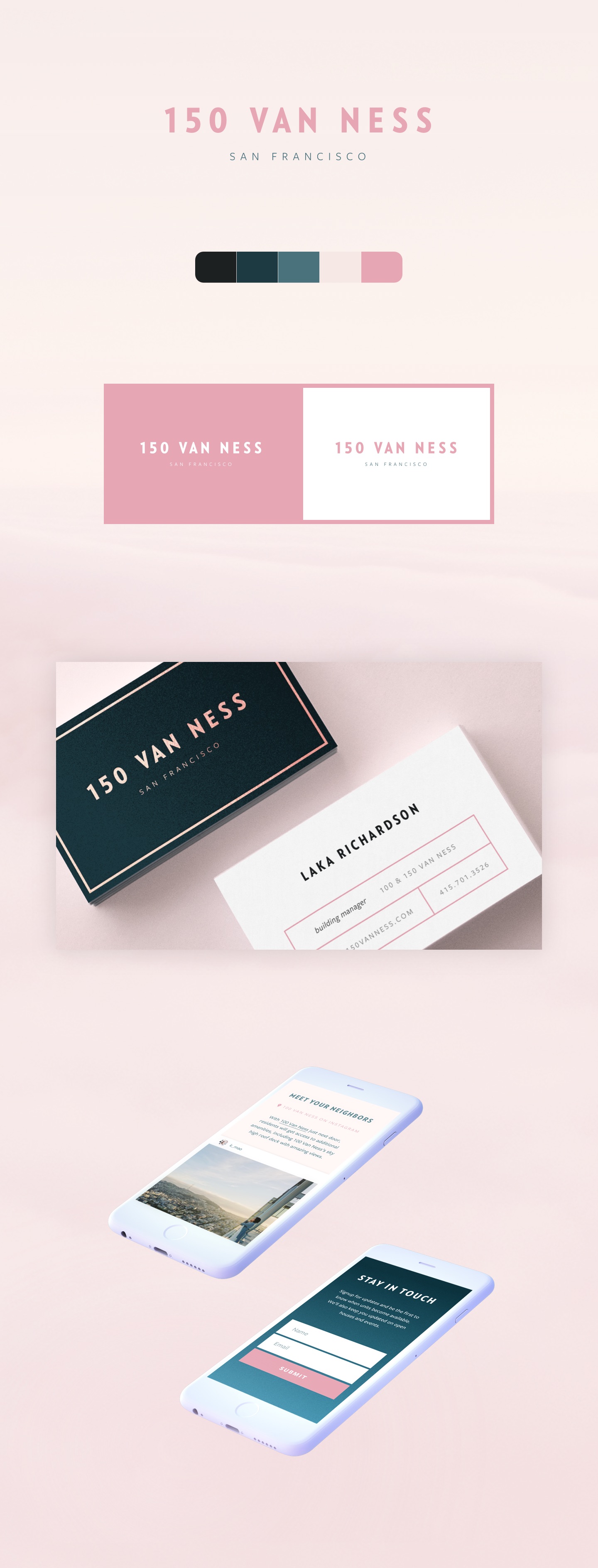
After working through color and moodboard explorations with the client, I put together a comprehensive branding system, working off the pastel colors of San Francisco. While the sister building, 100 Van ness works with darker jewel tone interpretations of these pastels, I took a more lively, retro approach for 150 to communicate the building's youthful energy.
focusing on differentiators
The responsive website focuses on the key differentiators for 150 Van Ness: location and amenities. To really drive home the central location, I worked with our strategist to put together an interactive location search, which allows prospective tenants to see how long it will take them to get to work or the park.
Completed at Brooklyn Digital Foundry


